As a part of an ongoing series of articles about the state of the classical music recording industry, PENTATONE’s graphic designer Marjolein Coenrady explains the processes and thoughts of designing an album for a classical label in the digital age!
The world of classical music is changing. As we are living more and more in a digitally-orientated world, PENTATONE changes its design approach constantly to keep up with the trends and movements of our time. PENTATONE is a label that pays a lot of attention to design, as it distinguishes us from other labels in the market. We love to show in a visual way that we are a contemporary and high quality label with renowned international artists.
As a designer at PENTATONE, I’d like to share with you my insights on how to stay up to date with the current music market.
1. We see the importance of a recognizable brand style
Over the last years, PENTATONE has further developed its clear brand style, that ties together all releases in an authentic and recognizable way. By using a bright sans-serif typography, and applying a thoughtful hierarchy to the text, we make sure that our titles stand out in the overwhelming environment of an album store or on an online streaming platform.
As well as the album releases in this brand style, we also publish albums that are part of a series and have their own look and feel. In our collaboration with the Orchestre Philharmonique du Luxembourg (OPL), elements of the architecture of the Philharmonie Luxembourg link together all the covers. In the PENTATONE Oxingale Series, a collaboration with renowned cellist Matt Haimovitz and composer Luna Pearl Woolf, the cover designs emphasize their refreshing interpretation of the classical tradition.
2. We are able to translate music visually
Representing a piece of classical music in a visual way is a challenge we love to accept. There are a lot of things that inspire us to create a unique cover image:
- The era in which the composition was written
- The environment in which the composer lived while writing his piece
- The structure, rhythm and pace of a composition
- The visual beauty of an instrument
- The concept or story behind a work, for instance with an opera
- The emotional atmosphere of a composition
The ultimate way to represent a release is by combining multiple of the above aspects in one design. For every release, we look at the best way to create a cover image. We work together with renowned photographers, who are able to catch the artist’s personality with their camera. Whether it is showing a beautiful photograph of the artist, creating a custom illustration, using a historic painting or contemporary photo, each time we do thorough visual research to find out what suits the release best.
3. We differentiate physical and digital designs
Times are changing. More and more, we notice that our customers use digital platforms (DSP’s) to enjoy classical music. This requires a different approach to the way we design our covers.
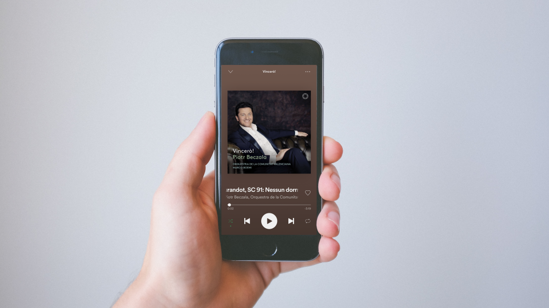
Recently we developed an update to our brand style, that distinguishes between physical and digital cover designs. On a thumbnail size, small text on a cover is not readable. And because of the fact that DSP’s show a lot of metadata next to the cover, it’s no longer necessary to show all the text on the cover image itself. This led to a new approach in designing for DSP’s, in which we use a bolder typographic style, a clearer and brighter logo and a slightly adjusted crop of the image. On streaming platforms, we proudly show the PENTATONE icon on both albums and curated playlists, as a quality approval that shows what we stand for.
4. We are a contemporary label, and our designs reflect that
The era in which classical music albums could be recognized by their sepia-coloured covers with a picture of a violin and sheet music, lays far behind us. PENTATONE is a contemporary label with a lot of talented young artists, and that’s what we want to reflect in our designs. Our hard work even led to being awarded Gramophone Label of the Year 2019. We are very proud that Gramophone not only gave PENTATONE credits for the recording quality, but also for the captivating packaging.
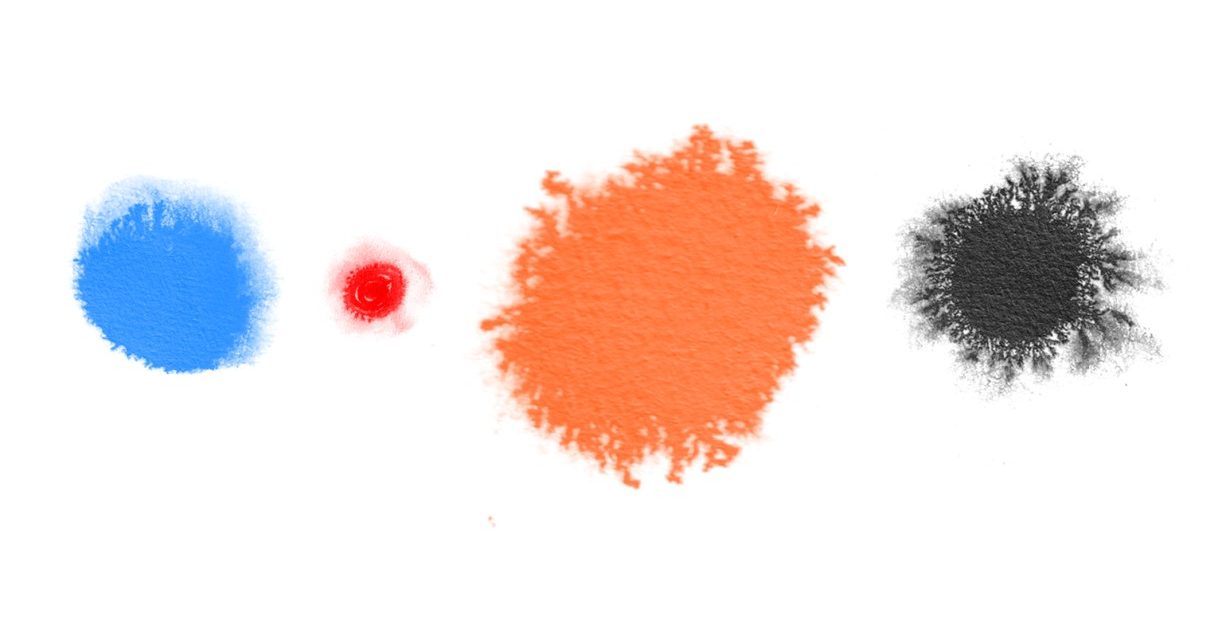
Colour is an important way for us to emphasize our contemporary approach, as this page from our brand book shows.
5. We celebrate the beauty of physical design
Although we see the advantages of streaming and downloading music, we still highly value the physical products we release. In carefully designed booklets that come with our releases, we enclose liner notes in multiple languages. These booklets are also a great platform to share a personal statement by the artist, along with photos of the recording process.
Once in a while we release some very special products, that are designed with a lot of attention for detail. These editions immediately become collector’s items.
Marjolein Coenrady, July 2020